
The Psychology of Branding: Why Your Logo Isn’t Just a Design
The Psychology of Branding
Your logo gets one glance to do its job. Most of the time, that’s all it needs.
Behind every mark that actually sticks is psychology quietly at work - color, shape, simplicity, all shaping how people feel about a brand before they’ve thought about it at all.
So if you’ve ever treated your logo as “just a design,” it’s time to think again.
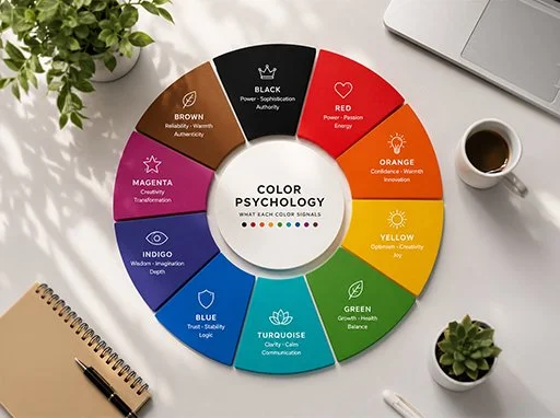
Table of Content:
The Logo as an Emotional Trigger
The Power of Color Psychology
Shapes and Fonts Speak Too
Consistency Builds Trust
When Brands Break the Pattern: The Gap Rebrand
The Subconscious Impact of Simplicity
Storytelling Through Design
Your Logo = Your Promise
Branding in the Motion Era
Final Thoughts
1. The Logo as an Emotional Trigger
Apple. Nike. Coca-Cola. You don’t need to read the name, the mark alone does the talking.
Nothing about that is random. Colors, shapes, fonts - the moment they attach themselves to a feeling, that feeling comes rushing back every time you see them again. Blink, and the trust is already forming.
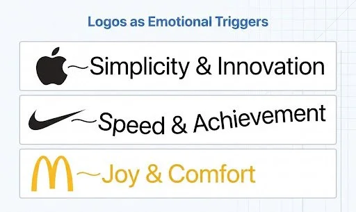
A great logo isn’t just standing in for your business. It’s already forming an opinion about it in someone’s head, before they’ve read a word you’ve written.
2. The Power of Color Psychology
Color is one of the most influential levers in branding, where most first impressions of a brand are shaped by color alone, often before anything else registers.
Each shade is doing its own quiet persuasion:
Red pushes urgency and appetite: it’s no accident Coca-Cola and YouTube both lean on it
Blue reads as dependable, which is exactly why banks and tech giants like IBM built their identity around it. We’re blue too, as you can depend on us ;)
Green settles the eye: think Starbucks, think Whole Foods, think “this is good for you”
Yellow feels approachable before it feels anything else - McDonald’s and IKEA both bet on that warmth
Black signals restraint and status - Chanel and Nike use it to say “we don’t need to shout”
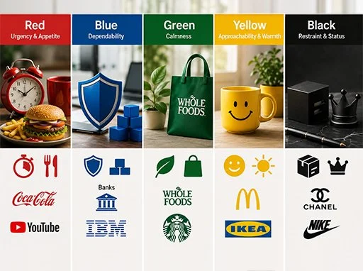
Picking a palette was never about what looks “cool.” It’s about choosing how you want people to feel - and being deliberate enough to make it happen every time.
3. Shapes and Fonts Speak Too
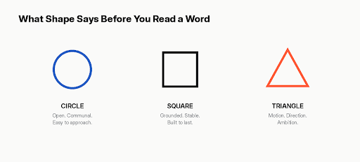
Long before someone reads your name, the shape of your logo is already talking.
Circles and curves soften a brand: they read as open, communal, easy to approach
Squares and rectangles feel grounded: the kind of shape you trust to still be there tomorrow
Triangles point somewhere: they carry a sense of motion, direction, ambition
Fonts are making the same kind of argument, just in letterforms. Pick a serif and you’re borrowing a sense of heritage - it’s why so many law firms and old-money brands never left it behind. Go sans-serif and you’re signalling ease, the kind of brand that doesn’t take itself too seriously. Script gets personal fast - it’s the handwriting version of a brand leaning in close.
Every curve, corner, and letterform is quietly telling your audience what kind of brand they’re dealing with, well before they read a word of copy.
4. Consistency Builds Trust
Show up the same way, everywhere, and something interesting happens: familiarity turns into trust. It’s the mere-exposure effect in action we grow to prefer what we recognize.
Your website. Your packaging. Your social feed. Every repeat appearance of your logo is a small deposit into the same account: credibility.
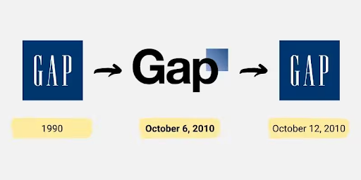
But that account can be emptied just as fast as it’s filled and few stories make that clearer than what happened to Gap in 2010.
5. When Brands Break the Pattern: The Gap Rebrand
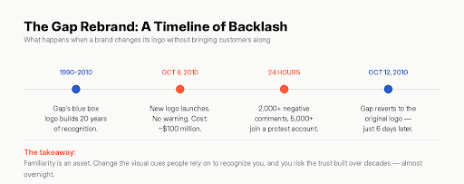
Gap’s dark blue box logo had represented the brand since 1990 - two decades of quiet, consistent deposits into that same trust account. Then, following a couple of years of slumping sales, leadership decided the brand needed a more modern look.
Source: https://www.thebrandingjournal.com/2021/04/learnings-gap-logo-redesign-fail/
On October 6, 2010, the familiar blue box was replaced overnight with a smaller box and a plain black wordmark. No teaser campaign, no explanation to customers the redesign is estimated to have cost the company around $100 million.
The backlash was immediate. Within 24 hours, a single blog post had drawn thousands of negative comments, a parody Twitter account protesting the new look had gathered thousands of followers, and a fan-made “design your own Gap logo” site collected close to 14,000 submissions.
Six days later, on October 12, 2010, Gap reversed course completely and brought back the original 1990 logo for good. Leadership later admitted they’d misjudged how much emotional energy customers had invested in that mark - and that they’d missed the chance to bring their community along with the change.
This is the mere-exposure effect working in reverse. Gap didn’t just launch a new logo; it broke a pattern people had unconsciously come to trust, without warning and without a story to explain why. The backlash wasn’t really about whether the new design looked good - it was about a sense of familiarity disappearing overnight.
The lesson for any brand: consistency is an asset you build slowly and can lose quickly. If you’re going to evolve your visual identity, bring your audience into the “why” before you change the “what.”
6. The Subconscious Impact of Simplicity
Our brains love simplicity. A cluttered logo makes people work for it, and nobody wants to work that hard to trust a brand.
That's exactly why Google, Starbucks, and Mastercard have all simplified their marks over time. Minimal logos scale better, recall better, and hold up whether they're on a billboard or a phone screen the size of a stamp. At Urban Nexus, we specialize in refining these complex identities into memorable, minimal marks that resonate instantly.

Simple isn’t boring. Simple is memorable, and memorable is what sticks.
7. Storytelling Through Design
The best logos are hiding something. Look closely enough, and a well-crafted mark often carries a piece of the brand’s story.
Amazon’s smile - running from A to Z, promising “everything”
FedEx’s hidden arrow - precision, speed, forward motion
Baskin Robbins’ “31” - tucked into the letters, a nod to 31 flavors
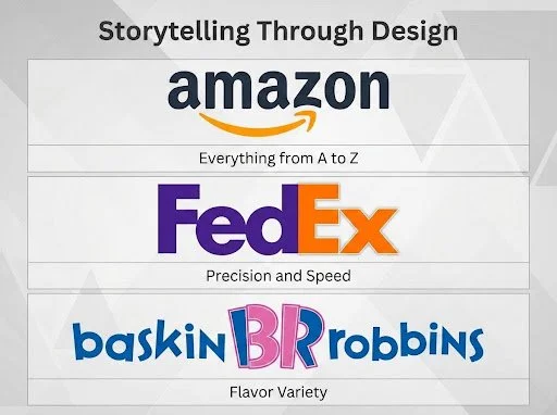
None of that is a coincidence, and none of it is filler. It’s a brand finding one more way to lodge itself in your memory so that even after you’ve forgotten the details, something about it still feels familiar.
8. Your Logo = Your Promise
Your logo isn’t art for art’s sake. It’s psychology, doing its job quietly in the background - shaping how people perceive, remember, and trust your brand.
So whether you’re building from scratch or rethinking what’s already there: think past the shapes and colors. Build a mark that carries your story - and think just as hard about how you’ll evolve it, if that day ever comes.
9. Branding in the Motion Era
Everything above still holds - but the canvas your logo lives on has changed. A mark today isn’t judged on a business card alone. It has to work as an app icon, a favicon, a loading animation, a dark-mode variant, and a sound cue, often within the same five minutes of a single user’s day.
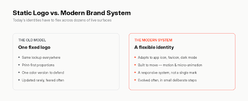
That shift doesn’t undo the psychology - it raises the bar on it. Simplicity now has to survive being shrunk to 32 pixels. Consistency has to hold across a dozen formats you don’t fully control. And “the logo” is increasingly a system of related marks and motion, not one static file.
The brands adapting best treat identity as something built to flex, not something bolted down - which makes deliberate, incremental evolution more valuable than ever, and a sudden Gap-style overhaul riskier than ever.
Final Thoughts
Thinking about what your logo is actually saying about you? Most people only ask that question after it’s gone wrong.
At Urban Nexus, branding isn’t the last step in the process, it’s where the strategy starts. Our team works as a dedicated partner to ensure your visual identity is a direct reflection of your long-term strategic goals. We don’t just design for you; we collaborate with you to build a cohesive brand system that supports your business objectives at every touchpoint.
Let’s figure out what your mark should be telling people.
Get in touch →www.urbannexuss.com